Saturday, December 5, 2009
Friday, November 20, 2009
For my first Iteration I wanted to make something that could be hung on the wall, as well as a luminaire that would be able to express the idea of contrast.
The reason that I did not stick with this idea was because it seemed like it did not convey the idea of light fields the way I wanted to. However my next idea did focus on the field of light more so than the object itself, but the field it created seemed too wide.In comparison to my third Iteration this model was a bit more bulkier and did not give off as much contrast. However the last idea that I decided to keep was an equal balance of contrast while at the same time giving off a field of light that wasn't "just" there.
Thursday, November 19, 2009
For the newest project we are working on we were to create a luminare that projected a field of light. As far as my project I wanted to focus more so on the field of light given off more so than the object or color, as well as the idea of contrast between the dark and light. In order to do this I researched both ideas of light and how they can create contrast. here were some of the main ideas that stuck out to me as well as inspired my project.
Contrast
Contrast
Space seemed like a good variety of contrast as far as the balance between the void and light.
The main idea that I got from this image was the field of light that was given off from the glow stick.
Its kind of funny but I also found inspiration from the logo of the Men in Black movies.
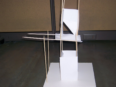
For one of our most recent assignment we were to create two spaces and define them using 12 skewers and 12 planes of Bristol board, also when coming up with our ideas we had to create a collage of images that inspired our idea. For my project my main inspiration was the idea of a skyscraper as well as the formation of construction sites.
When going about creating the project I wanted to keep the idea of building upward in mind. I also wanted the two spaces that i defined to be in upward and downward directions. My first iteration wasn't as successful due to the fact that it created more than two spaces in between the materials. Also the craftsmen ship could have been a lot better. However in my second iteration it seemed better to build less upward and more outward in order to define the downward space.
After my second attempt i decided that I wanted to stick with this idea because it defined both of the spaces in each direction that i desired. After this I made one more model in order to enhance the craft of this project.
Tuesday, October 13, 2009
Sunday, September 13, 2009
In our most recent asingment our class was given the task of drawing a Pure contour of the Foust building located on campus.
The angle that I had was kind of tough for me to get because I had to draw around a bush, but I didn't want to move because I liked the way that the building looked from that angle.
Thursday, September 3, 2009
For this project our class was required to choose two natural items and find a way to connect the two using a linear object. For my project I chose to use a rock that I found outside of my dorm as well as part of a tree branch that I found on a dirt path, I also connected the two using a yellow ribbon that I found.
When connecting the two items my original thought process was based off of the idea of a bow and arrow, but after hearing a few ideas during our class critiq I decided to focus more on playing the idea of the tension that the objects created.
I was actually satisfied with this idea because it deals with a very important concept in Architecture and design which is tension.
Sunday, August 30, 2009
After visiting other sketch blogs on here I have come to find that one blog in particular really caught my attention this was YKBK. The reason I like this blog in particular is not because of the information on the website, to be honest I can't really understand Spanish, but what drew me in was the artwork and layout of this page. The reason I like the artwork on this blog so much is because it all seems like sketched out blueprints, floor plans, and ideas for buildings. I find it interesting to be able to get inside of some one's head and see their thoughts and ideas, and I feel that the creator of this blog did an excellent job in communicating their thoughts and ideas through simple sketches and drawings without having to focus in on detail as much. I think that it stands out because the sketchings have a quality about them that gives the viewer enough detail to understand what the artist was thinking without having to create a drawing that is neat and perfect. Overall I think that this blog caught my attention because I can relate to the way in which the artist renders his artwork in order to express himself.
Wednesday, August 26, 2009
YKBK
After visiting other sketch blogs on here I have come to find that one blog in particular really caught my attention this was YKBK. The reason I like this blog in particular is not because of the information on the website, to be honest I can't really understand Spanish, but what drew me in was the artwork and layout of this page. The reason I like the artwork on this blog so much is because it all seems like sketched out blueprints, floor plans, and ideas for buildings. I find it interesting to be able to get inside of some one's head and see their thoughts and ideas, and I feel that the creator of this blog did an excellent job in communicating their thoughts and ideas through simple sketches and drawings without having to focus in on detail as much. I think that it stands out because the sketchings have a quality about them that gives the viewer enough detail to understand what the artist was thinking without having to create a drawing that is neat and perfect. Overall I think that this blog caught my attention because I can relate to the way in which the artist renders his artwork in order to express himself.
Subscribe to:
Posts (Atom)