1. When comparing the artifacts from the reading I have found that the principle of contrast is the main language of design connecting each of these items. Looking at each of these artifacts it is the one thing that stays consistent among them. For example the light marquetry and ornamental designs that adorn the desk and bookcase from the Neo-Palladian and Georgian period contrast its heavy structure and solid appearance through the use of carvings of flowers and bronze and gilt. In the case of the Windsor chair, which was first imported from England in the 1720’s, the language of contrast is displayed through the use of repetition between the spindles of the chair and the open spaces between it. There is also a contrast in the proportion, size, and form of some of the high back Windsor chairs compared to the “splayed” formation of the legs. However this unusual proportion was necessary because most chairs from this period were designed to be functional and more comfortable, in fact Harwood states “Comfort is important, so arms curve and seats contour slightly to fit the body.” In the early neoclassical period the same type of contrast that was evident in the Neo-Palladian and Georgian period between the artifact and its ornament reoccurs. This is seen in Martin Carlin’s Tall clock where the golden intricate carvings and bronze gilt decorate the heavy, solid and rectangular clock. Later in the English Georgian period the same language re appears with the design of the State Bed in Osterley Park. This bed shows contrast between not only the proportion of the actual rectangular bed to the round posts that support the canopy above it, but also in the structural formation of the bed in comparison to the free flowing hangings that would be draped above the bed. Lastly, the ornamental design encircling the urn on the back of the Sheraton side chair contrasted the overall rectangular structure of the chair.
Looking at each of the spaces given it is evident that each of them expresses the same language of heavy roman influence. The Holkham hall clearly derives most of its design from classical roman architecture, from the entire layout of the building down to the front portico and use of arches on the facade. Gunston hall also follows this language with its symmetrical interior as well as the ornamented stair way decorated with arches, columns and pilasters from classical roman design. The bedroom of Marie Antoinette also shows this language with the use of a lightly colored pallet, swags, symmetry, and a geometric curves and straight lines. While most of the buildings clearly follow some form of classical architecture the Saltram house through its ornamentation instead of geometry and symmetry. The use of decorative swags, pediments, urns, and other roman derived symbols tie this building in with the other. Lastly the Gardner –Pingree house like the rest of the spaces uses roman decoration in order to celebrate classical design, which is most prominent on the mantel above the fireplace in the parlor.
When comparing buildings like the Chiswick house, Nathaniel Russell house, Drayton hall, S. Genevieve, and Montechello, one major language of design that stands out is ornamentation. Each of these structures are highly decorated with influential design motifs like pilasters, columns, arched windows, and pediments, which are all a product from roman architecture and influence that help create an overall state of harmony throughout the building. It is evident that in each of the scales that were covered are connected through the use of design principles like symmetry, harmony, and contrast in order to convey one language of design through roman influence.
2. When looking at American design and culture one thing to keep in mid is that just about everything the American’s got during this time was from across the Atlantic in Europe. Since this was a developing country at the time buildings were smaller in scale, less formal; less refined, and had a more horizontal emphasis. Architects are building for common wealth and middle class families as opposed to royalty. Also the people who are building are not necessarily architects, but people simply trying to make a living. For example the Gateleg table, Arailiures, Armoirs, and Shrank are all examples of less formal pieces of furniture that differ from the intricate designs we see in Europe, however there are traces of European influence on these artifacts. Also buildings like the Hart House Chamber, Columbus House Entry, Parlange Plantation, and Jackson House display one of the main ideas in America during this time, which was to make things more functional than decorative. This was done with the use of beamed ceilings and spaces for multipurpose use making these spaces functional. The use of light scale, rational planning and mathematical proportions to help form their structures and emphasize straight lines and geometrical forms were a way to break away from European design. While it was important for interiors to be different from the styles of Europe it became somewhat of an unavoidable art. Almost all American made architecture during this time mainly reflected the styles of English, French, and German architecture which shows the strong influence that each of these countries had on the foundation of American design.
3. I designed this building based upon the Balletto Terzo. It seems fitting because Palladio was known for his use of geometric structures as well as symmetry. This villa contains room a family to live and gather friends from the wealthy class of Italy during this time period.
4. Personally I do believe that the designs and architecture in the Baroque period are a form of social performance in the theater world. This is because most of the buildings in the Baroque time period were designed to move away from the more structural and symmetric forms that were seen in time periods before and more towards artistic structures. In baroque style architecture the effect of movement and action was more important than the effect of symmetry and balance that dominated the art of the Renaissance. “Baroque artists aimed to undo the classical unity of form and function, to unbalance the composition and achieve the impression of movement and space that the new age demanded.” (Norman) When we compare this to actual theater and the ideas that are expressed in this art, which are to emulate and evoke human emotion, we can see these same ideas present in baroque design, which gives the same qualities as the art of theater. One building that I feel captures the essence of the baroque theater movement is the Coranro Chapel. The main statue in this building is an example of how architects attempted to capture human emotions in their work, the same thing an actor would capture in their film.
Monday, October 18, 2010
Thursday, October 14, 2010
Wednesday, October 13, 2010
Assignment 4.0 Communicating to non-designers
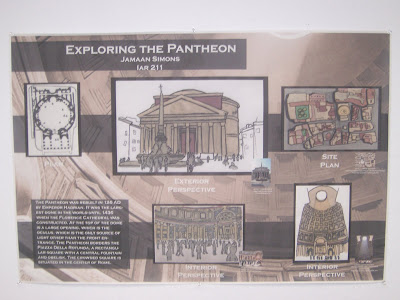
With this assignment I wanted to be able to communicate my ideas to non-designers through the use of interior, exterior, and building perspectives of the Pantheon. I feel that this was a more succesful atempt thant the previous assignmnet where I attempted to use diagrams in order to communicate the space.
Wednesday, October 6, 2010
Point: Foundations
During the foundations unit most of the structures that we have discussed transcended the way that architecture was viewed in their respective cultures and have taken original ideas of building further. Through out these time periods new methods are developed for more effective forms and structures. We also see the use of arches, vaulted ceilings, flying buttresses, and domes, which have lasting impacts on buildings to come. The scale of buildings are also taken to another level, as seen in the Roman temples to the Cathedrals during the “Dark Ages” and the idea of the Wu-Wu, emphasizing on the importance of the power of verticality. The idea of stacking also occurs both in the structures like the Roman Coliseum and the Cologne Cathedral. The use of stacking allowed buildings to be built upward with stronger support. Arches were also used to help support and strengthen these structures. However we see the use of flying buttresses in the Cathedrals, which was a new idea to help expand the idea of verticality and reaching Heaven. Stacking doesn't only serve the purpose of firmness, but also serves as a commodity because of it allows more room to be used, and ads visual delight to buildings like the cathedrals. At the same time the Romans stacked with the use of arches for structural support because horizontal stacking was the most important to the Romans.
http://starlightwalker.com/blog/?cat=8&paged=2
We are also able to see how important the elements of Circles are in two of the cultures we studied in this unit which were Rome and England. The idea of the circle was important to the function of worship in religious structures like the Pantheon in Rome. This can be compared to the Stonehenge in England. The Stonehenge is one of the most mysterious structures that stands today, however there are hints indicating that it could have been used for religious purposes. The idea of using a circle to worship creates an area where there is complete equality among those who are in the structure, but the verticality and scale of the structure is what emphasizes on the function of the building. In the case of the pantheon the size of the space emphasized on the power of the gods and made one feel small in comparison to their might almost forcing religious experience on them.
We also see in this unit the use of line as a form of building. It is evident with the rise of Mycenaean architecture. Unlike the earlier Minoans, whose architecture was based on a carefree culture that took pleasure out of life, the Mycenaeans built large walls around the city of Mycenae in order to fortify it out of fear of invasions. Another culture that also uses this form of building is the Roman culture with the use of structures like roads and aqueducts. While there were not exactly buildings or places of worship, these structures helped to transport people and items freely along an axial plane. For example the aqueducts transported water into the city and help provide for the baths. At the same time the roads of Rome all met at crossroads at some point or another, which almost supports the phrase “All roads lead to Rome.”
http://www.travelblog.org/Middle-East/Syria/South/Bosra/blog-349839.html
Friday, October 1, 2010
Compass Project
For the Compass project I chose Place ans my scale and Word as my form. This project was mainly about The Great Pyramids in Egypt, I Incorporated the idea of compass in this project by placing the pyramids at the top of the image pointing upward. This was also a concept behind the creation of the Pyramids because they were intended to be stretching towards the Heavens. I also chose the word Legacy because it best describes what the pyramids were about, which was leaving behind the Pharaohs legacy. The statue in the background is an image of King kaufu who is credited for building the pyramids. Lastly the symbolism in this project is represented by the Hieroglyphs in the sand which also help to leave the legacy of the Pharaohs.
Reading Comprehension 3
One of the first things to note about the Cologne Cathedral is its vast and grand scale. This also adds on to the idea of building up towards the sky and Heaven and enhancing the religious experience one would have as they approach and enter the building. Lighting was also a very important aspect of the cathedral. This was made evident through the use of the main forms of natural lighting during this time, which were clerestory and stained glass windows, as well as ribbed vaulting.
The Salisbury cathedral has a more complex plan than the Cologne Cathedral. However light still remains as one of the main elements when building this cathedral especially during the dark ages where people felt that there was no change or movement culturally. The use of light in this building can be compared to the Cologne cathedral because they both attempt to make the lighting effect more dramatic. This adds to the religious experience one would have when they enter, by making the church seem more purified that any other building or structure around this time period.
The Amiens Cathedral has a layout that is the closest to the Cologne Cathedral. In fact most of their similarities are mostly structural and decorative. One of the main similarities seen here is the introduction of flying buttresses. Flying buttresses were an important aspect in the vertical build of both Cathedrals. Originating in Notre Dame, France flying buttresses allowed a building to be taller with a more stable structure. Also the exterior details on both cathedrals have similar images causing one to believe that the purpose of these buildings are influence by the same beliefs.
Unlike the previous building that were compared many differences take place in the Florence Cathedral in comparison to the Cologne Cathedral. The entire structure of this church is different because it actually symbolizes a change and a preview of what is to come in the renascences age. The Florence cathedral has evident roman influences in its structure like the dome which helps set it apart from the traditional pointed and vertical churches. The dome signifies a change in attitude toward the church and what feeling people should get from it this also goes back to the round effect that one would feel in the Pantheon making the presence of whoever was being worshiped more omnipotent.
In this Image the woman is in the kitchen cooking, possibly preparing a meal for multiple families because it in common for several families to live in one castle or household during the dark ages. During medieval times many interiors were made for communities to live in. Roth mentions that the kitchen would be located towards the back the house in his book Understanding Architecture (345). So it would be evident that the opening behind the pot would be the back door and a window allowing the smoke from whatever it was that she was cooking to escape. There would also probably be a hallway behind the woman leading to the community area where everyone would be gathered around the fireplace conversing.
Friday, September 24, 2010
Subscribe to:
Posts (Atom)